Friday, 21 January 2011

Diary Entries for my digipak

Day 1:
                     Here was my visual idea of the front of my digipak in relation to my initial ideas.


Here are photos of an outline that I wanted my digipak to look. I cut an A3 paper into two, I then folded the two sides to the middle, leaving 6 squares about to visual how my digipak would look like. After the successfulness of this, the whole class did the same.


Day 2:
                                      
As a group, we decided to make a logo as a trademark for our group, we then came to a final idea of how we wanted our logo to look like, as seen in the above photo. In the blog, you would see the expansion of the logo idea and the final outlook of it. 


Here are photos evidencing me and Tia planning out digipaks. 


Day 3. Digipak idea 2
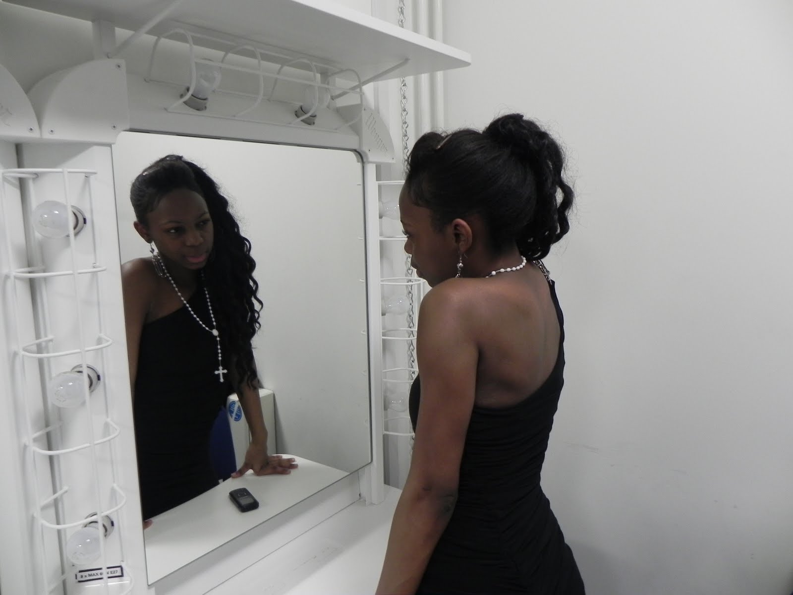


Day 4. Individuals


These photos are the right poses I want to use for my digipak however as the lighting came from the left side it attracted only the left side of the body leaving the right shadowed this led to unlevel in brigthness which has to be edited.


Day 5. Individuals 2


6. Photo Ideas cleared


7.Graffiti


The snapshots that was in the grafitti location allocated that this was the right area to take photos for my digipak. This was because the bright coloured grafitti is eye catching which is an attention I want my targetted audience to feel.

8. Development in Ideas
 I decided to try and develop my digipak ideas even more despite coming up with a decision of how every picture should look like per panel. I saw the below room in college and thought it might work well in relation to one of the photos were my group are poseing in front of a mirror. I like the photos taken evidenced below but I came to a conclusion that if I produced a photo like the ones below It would mimick too much of the other photo. Therefore I kept the final digipak idea.

Here is a photo of where I took these pictures.


9.
Here is the day we went to the graffiti location were we shoot the music video in relation in following my ideas and how I want my digipak to look. The images as you see below were not successful as we did not get a professional to get right frames/shots. Also some shots did not fit in what we are trying to tell the audience. 


Not all are looking in the shots above so therefore they could be used in my digipak. 


The above photos do not show detail on jewellery and yet again, not all are looking in the camera.

Above the shots are not framed but I used one for my front cover and I did work well from zooming and positioning. 

Here is expanding my digipak ideas. 


10. I used specific photos for my digipak.


11. In the editing process I chose the photos for each panel. I have a different post about this later on.
As I changed my theme to the logo I made changed i.e. instead of having a split screen of the 3 individuals, I split in four and made the last screen the logo. I also made the background the logo with a pink background. This is similar to my initial idea of front of back (the front to have the group standing up in the graffiti background and back to be sitting down.)
You would see the progression as you would see the final choices made.


Diary Entries for the Music Video

PLEASE NOTE: ALL VIDEOS WERE MADE BY ME.

DAY 1 :


As you can see the footage we took was too dark and moving the camera to the mirror did not work.


DAY 2:

This day we improved my chorus by using shots showing the reflection making things too effective.


DAY 3:


DAY 4:


DAY 5:

Tola's roof
Here is a video I made of clips we did on this day.
PLEASE NOTE: We lost a lot of our clips


DAY 6:

Tia's Grafitti  - Here is an overall journey of different days we were in the graffiti location. You can see the problems that occured, i.e. the day when the shots were too bright.


DAY 7:
Tia's Grafitti -
The shots were too Dark despite on the camera it looked okay; when captured on 'Final cut' it was too dark, even if we changed the brightness and you can see some shots that have been edited.


DAY 8:
Feedback


Day 9:
Here is the final day of creating our music video having a deadline we had to make changes our plans. It quiet a busy day but we done everything in a few hours and because we had so much ideas It wasn't long to do the finishing touches.


Here are clips of the final day.
PLEASE NOTE: THE 2ND WRITTEN SIGN SHOULD HAVE SAID 'TIA'S CHORUS HAD TO BE DONE, WHICH WE THEN INCLUDED JUMP CUTS'


Day 10.
Changing The Beginning of the music video, due to spelling errors.

Thursday, 13 January 2011

Misc-En-Scene/ Locations


MISC-EN-SCENE


Money represents weathiness and shows the audience that the group has a lot of money and may be very materialistic.


              The dresses and heels connotes to the audience I have the femine personality within the group.


This shot is us three as group as you can see sunglasses, dresses and earrings. These all fit in the codes and conventions and work because they are showing wealth to the audience. the graffiti background works well yet again.

We used a pet dog instead of a pitbull dog in following codes and conventions. We break this to show the more positive side.
                                             A shot of money being used in the music video.
The grills is signifies money as many hip hop says 'its money in the mouth.' It shows the codes and conventions as many use this in terms to show the artist has money and has a reputation of that people with attitude would have it.


LOCATIONS

Many hip hop artists use graffiti establishes the genre of the song. Graffiti is known as a crime but many black teens like to graffiti because its their hobbie and feel its a form of expression. Below is another graffiti picture. This was the location for the first verse; Lil Kim's part.
Here is a shot were we show a establishing shot of the location.

DANCE STUDIO


This is where I did my mirroring shots and other as from an influence from the Cassie 'Me and You' video.

(On the roof)
The roof is done to emphasis what our group is able to do, which is what others can not do.

Recce

Recce we took in urban areas to reflect on codes and conventions.
Here are the three main places we went.
We went to known estates and parks to establish to the audience the urban background of the group.
It also allocates the target audience, despite its mainstream, black teenagers would still interact with the music video despite most likely prepare underground music.

Genre


My genre for that my group categorise ourselves in the RNB and hip-hop genre. This is due to the music, beat and lyrics, e.g. lyrics are about the success the artist has made which is known to what many artists from my genre lyrically always speaking about.
Also, the music is not 'caused music' i.e. issues in the the world but about probably the artist or personality/attitude.  

The following photos show artists that are follow the same genre as my group. They all follow the codes and conventions of the hip-hop/ RNB genre as they wear expensive jewellery and show this explicitly.
You can see in the photos its either artists take photos looking serious to probably seem that they take themselves seriously or smiling to show personality.


 HERE ARE VIDEOS THAT ARE IN MY GENRE CATEGORY:

This fits the genre and conventions as the artist (rapper) wears sunglasses and a cap. The girls dance sexual which is also a code and convention.

2.

This fits in as the girls dance yet again sexual.

3.

The girls are dancing yet again. This video really expand in forms and conventions as the costume fits in the genre; grills, piercings, caps, big chains, earrings and hoodies.

4.

Ciara is wearing sexual clothe such as heels and has a expensive car to show her wealth She is dancing yet again.

5.

The location is in a SFX studio and Birdman shows his tattoos. They also have a lot of money and show this by throwing it and cars. Drake is also wearing sunglasses and has a watch on.