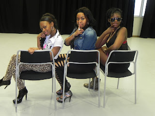
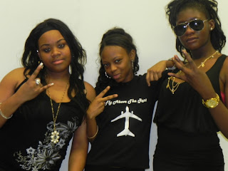
The following photos are were we took photos were we thought were appropriate for our digipak.
My idea was the mirroring photos and as a group we developed into different poses. Additionally, the photos next to the wall were photos for the planned Black and White edited photo. Togetherness has been denotated through the tightness photos. Different oersonality photos have been shown in contrast from a bit of separation of each artist.
Here is an example of a photo that did not work well therefore we had to do them again; the curtain was in shot.
The two above photos were re shot due to the poor lighting and too far away from the camera.
I like the above photos as they show personality, are good shots were you can see the reflection and what each artist is wearing. The lighting has improved due to the change of positions.
I liked this photo enjoyably because I like the shot chosen however I dislike the fact as a lot of items were in the back therefore It needed to be editted a lot, (I had to clone the photo through PhotoShop.)
This photo was no centralised.
I chose this photo to be put in my digipak, this is because I prefer it than the others below of the same style and it shows togetherness and personality; the long shot shows what each artist would wear.
It also seems its in a place for a concert or show; in a studio.
This photo is too blury.
I like this picture rather than the rest that are similar to this shot as the framing is good and I like the poses


No comments:
Post a Comment