Monday, 7 February 2011

The section In the Dance Room


The following photos are were we took photos were we thought were appropriate for our digipak.
My idea was the mirroring photos and as a group we developed into different poses. Additionally, the photos next to the wall were photos for the planned Black and White edited photo. Togetherness has been denotated through the tightness photos. Different oersonality photos have been shown in contrast from a bit of separation of each artist.


Here is an example of a photo that did not work well therefore we had to do them again; the curtain was in shot.


The two above photos were re shot due to the poor lighting and too far away from the camera.


I like the above photos as they show personality, are good shots were you can see the reflection and what each artist is wearing. The lighting has improved due to the change of positions.


I liked this photo enjoyably because I like the shot chosen however I dislike the fact as a lot of items were in the back therefore It needed to be editted a lot, (I had to clone the photo through PhotoShop.)


This photo was no centralised.


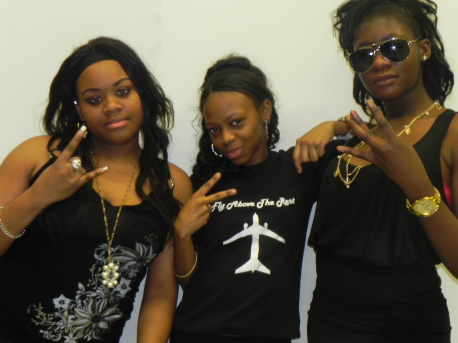
I chose this photo to be put in my digipak, this is because I prefer it than the others below of the same style and it shows togetherness and personality; the long shot shows what each artist would wear.
It also seems its in a place for a concert or show; in a studio.


This photo is too blury.


I like this picture rather than the rest that are similar to this shot as the framing is good and I like the poses

Friday, 4 February 2011

Editing

Here a few photos below of me and Tia editing:


Editing was quiet easy but difficult when doing this Advanced Portfolio. This is because despite knowing how to use the software, the effects are different to last years as my movie was quiet plain and simple due to the 'reality' of the genre. The issues were improving the brightness on shots. The footage also took long to upload due to being so much and when it was uploaded we didn't know what to include. It was quiet difficult to get the lipsynching in place. It was quiet fun doing the editing such as changing the pace of shots and choosing the appropriate percentage i.e. changing it from 100% to 80% to make it slower. I am happy with the editing process as the final outcome of the video is very energitic and lively.


Here is a photo of changing the shot to black and white.


                                                       Above is the time-line of the video.


If you look at the timeline you would see that the two footage is on top of each other and lines are connected, this is so the shots can be played at the same time. If you look at the shot you can evidently see this. This is so one of the shots does not look two bright and it is a good effect also.


Above is overall outlook of editing the music video.

Thursday, 3 February 2011

Anton Corbijn - Compostion


David Slyvian is a Dutch Music Photographer creating depth images and uses a lot of art references towards music videos, this could be for example, visual to the sound. He uses the cut; Jump cut. This is effective as viewer may experience may jump as they use to see music videos to use a normal cut or it to flow. He is famous for the visual outputs towards bands videos such as U2 and Depeche Mode.


He is now a movie director and is more famous films are Control or Lastest film 'The American.'


Here is some of his work. You can see that imagery and composition is very important to him as you see the positions and image in these music videos.


Depeche Mode - Behind The Wheel


I used this skill in my work, this would be shown through this using jump cuts in my production. I used this technique through my Preliminary task, as seen, however, this was made through creative ideas. After learning what Jump cuts can do, it influenced me to use this in my music video. I learnt how to make the most of it, i.e. extending the last shot for a more effect.
Please note: Double click to view

Saturday, 29 January 2011

Michel Gondry - Imagery

DAFT PUNK - Around the world

I personally like this video because it is very busy and a lot is going on which makes the video eye catching. It is also Unique use to the grasp amount of characters and I like each different character moves to each instrument/ or a part of the beat.

Video:


Interview :


WHITE STRIPES - THE HARDEST BUTTON TO BUTTON


I like this video because it makes you image how they made the drum kit/s continue. I also like the way the movements goes with the beat.


SUGA WATER:

I thought this video is interesting because it catches the eye and makes you look at each screen. This makes things interesting as action has been placed in each screen and they have unison in movement.
The contrast of the lifestyles but the connectivity each people has. Additionally, I like the reserving and the swap after the incident half way in the video. 


Sugar Rush from on Vimeo.


LE TOUR DE PARIS :
This is particularly one of my favourites of Gondry's work due to the use of him finding all the words of the song and capturing them I also like the use of them going in beat.


From influences from Gondry, here are shots that I took from my music video that I think has good imagery.

Monday, 24 January 2011

Equipment

TRIPOD
Here is the three legged tripod we used for the foundation portfolio and now advanced. It caused problems through producing the music video as the tripod handle was stiff therefore it was hard to do pan up or downs. It was also hard to move the camera left to right without it being shaky.

SONY CAMERA A1E
Me and my group used the same camera for our foundation portfolio (Sony Camera A1E); this is why I was fluent in how to use it. They were some problems that accorded such as battery dying, stiff tripod making my and group having to postpone our work despite bringing out two batteries at times. We also came to a conclusion that we shall use the Nikon Coolpix camera (below) because it could film aswell and because of the clear photos produced we thought we could use it, also it did not have a lot of sunlight as the Sony A1E camera was too bright. However we did not use the Nikon camera in the end because the camera was shaky because the tripod did not fit the tripod (above.)


NIKON COOLPIX CAMERAMe and my group use the new equpiment provided to produce great, focused, well pixelled photos. I liked the camera because it was easy to use as the settings were very easy (turn the nob to choose portrait, landscape, automatic or manual) and to take a photo was just  to click a button. Additionally the camera has a flash to enlighten photos.


This is what we used to play the song in the dance room to make lipsynching easy and to be insynched in time of the music so when editting it would be easy to get the lipsynching right. The phone blackberry usb cable was connected to the stereo.

Friday, 21 January 2011

Photoshoot Tutorials

Software we are using for editing our digipaks and producing perfect professional sort images is'Photoshop.'


DAY ONE:


What I learnt is the following:

1. Resolution : Changing the dpi from default 75 to 500, giving access to do more effects to work and work more professionally.

2. Layers: Making layers makes things easy to place things, able to put whatever you want to put
it.


DAY TWO:


Diary Entries for Magazine Poster

What is been included -
1. due date
2. name of album including single 'Swag On' which is song of music video.
3. which links to Promo
4. Clothes line in relation to digipak


Day 1:
By following my first initial ideas, I went on the Internet and created ideal fonts I thought would be suitable for the magazine advert, this included bright colours and Graffiti font in relation to my digipak cover and back font. For editing issues, I couldn't do this idea. My idea then was to use a smoking machine to illustrate the 'sexiness' and 'wowness' of the group. Unfortunately, I couldn't do this idea because my group never brought clothes and time was running out.


Here are the words I made from the internet I thought were appropriate for my magazine advertisement.

Day 2.  As a group we took photos for our magazine advertisement. I chose to take a photo to just be long shot behind a white background. I wanted to do this because I know I can edit it up and make it look nice by including bright colour in consistency to my digipak photos which are quiet colourful. This would tell the audience what personality my group has and what type of songs my group would sing.

Here the photos taken on the day

Here is the chosen photo, I chose it because it good framed and shows facial expressions, express each persons personality.

Day 3: The progress of making my magazine advertise. I made a white background.
I then changed my idea to get individual photos and then black and white the images to emphasis each person and showing the true side of the group.

Day 4:
 This day included writing the information for my magazine advertisement, this included, 'out now' and name of album.


Day 5:
This day included icons in relation to the information given i.e. clothes to go with the website given at the bottom. This is a continuation of my digipak as a panel includes audience to have the access to buy clothes. I use a shirt I had for that panel and put on the magazine advertisement so the audience would be familiar with the clothes.


popular icons used:
The targeted audience would know these icons.


DUE TO TECHNICAL ISSUES I CAN SHOW PHOTOS OF THE DIFFERENT CHOICES OF PHOTOS I DID TO THE FINAL PRODUCT.